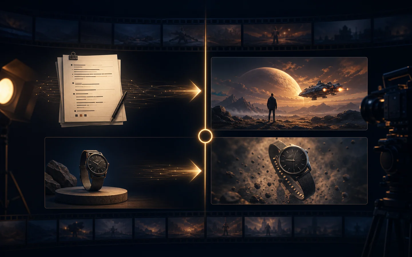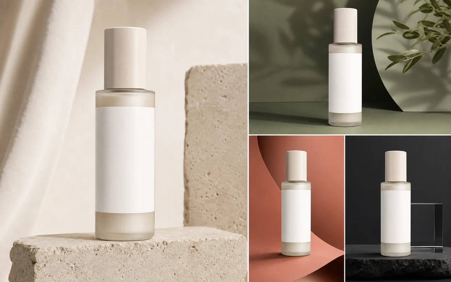
Best AI Poster Generators: Movie, Event, and Campaign Posters
Compare AI poster workflows for composition, visual hierarchy, reference control, readable typography, editing, export, and production across movie, event, and campaign designs.
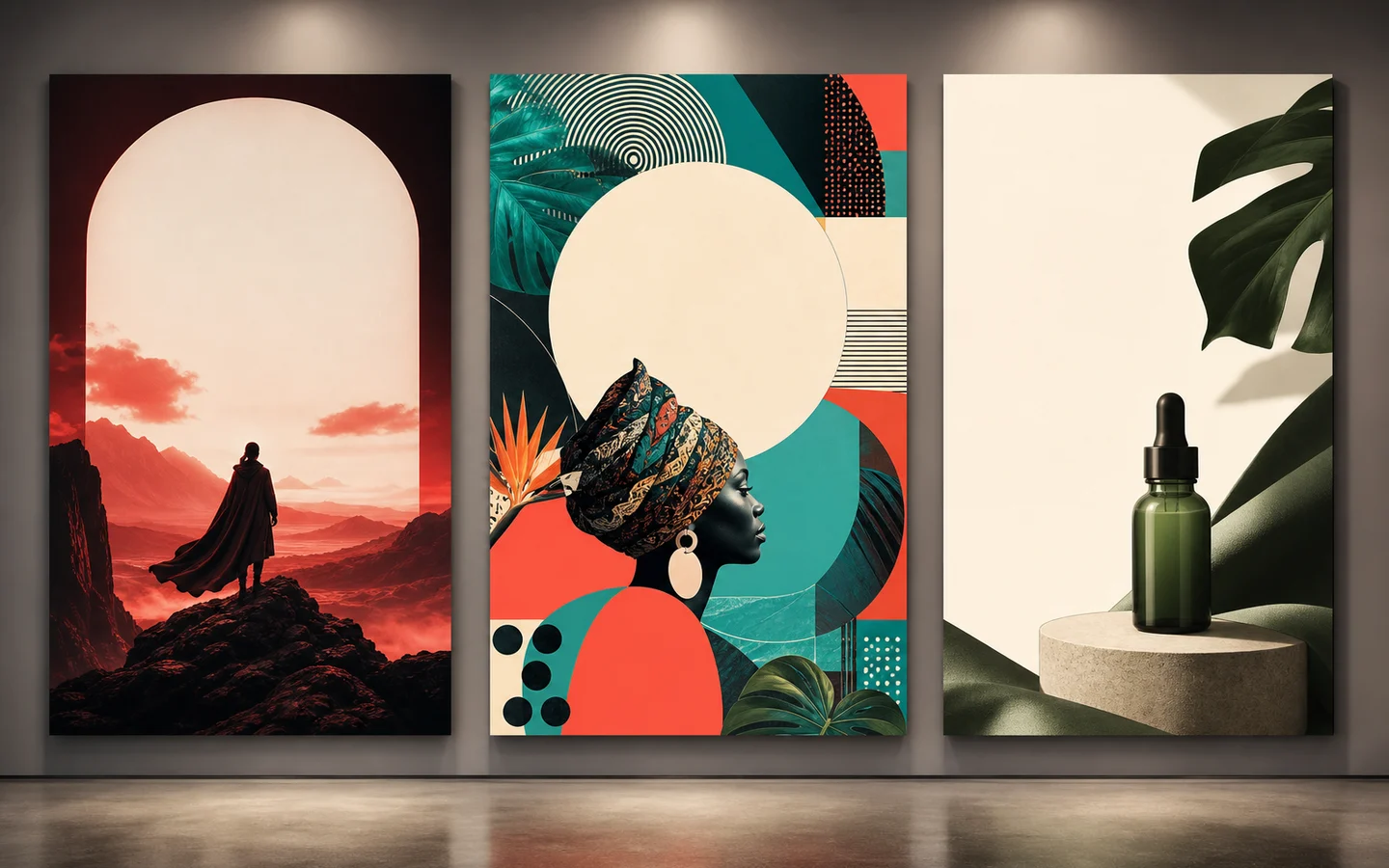
The best AI poster generator should help you create a strong visual hierarchy before it tries to render final typography. Posters depend on composition, focal point, contrast, empty space, image quality, and readable event or campaign information. Image generation is only one part of that system.
This guide compares poster workflows available in AI Image Editor. It focuses on movie, event, and campaign posters and does not claim that every external design platform was tested.
Quick recommendations
- Best for a new poster visual: GPT Image 2 when the prompt needs detailed composition and art direction.
- Best for reference-led poster variations: Nano Banana 2.
- Best for visual exploration: Seedream 5 Lite when its current controls fit the brief.
- Best for revising an existing poster image: AI Image Editor.
- Best for preserving an approved reference composition: Image to Image.
- Best finishing workflow: generate the visual with intentional text-safe areas, then add verified typography in a design editor.
What makes an AI-generated poster useful?
A poster must work at more than one distance.
- Thumbnail: the focal image and color contrast are immediately recognizable.
- Mid-size view: title area, subject, and supporting information have clear hierarchy.
- Full size: image details, edges, and typography remain clean.
Evaluate:
- Focal point and reading order.
- Contrast behind every planned text area.
- Safe margins and crop flexibility.
- Space for title, date, venue, credits, or CTA.
- Subject anatomy and object geometry.
- Reference consistency across a campaign.
- Ability to revise one element without rebuilding the entire composition.
Do not accept a poster only because it looks “cinematic.” It must leave practical room for information.
GPT Image 2: best for detailed poster art direction
GPT Image 2 is useful when the visual brief combines subject, environment, genre, color system, composition, and negative space.
Example movie-poster visual prompt:
Create the key art for a contemporary mystery film poster. A lone figure stands at the edge of a flooded modern plaza at night, reflected architecture forming a subtle visual maze. Deep blue and silver palette with one warm amber light. Vertical composition, strong central silhouette, clean dark space across the upper quarter for a title added later, restrained lower area for credits. No readable text, no logos, no watermark.Ask for blank title space instead of relying on generated final copy. Short display text may look convincing, but dates, names, prices, and legal lines should be added from verified source text.
Nano Banana 2: best for reference-led variations
Nano Banana 2 is useful when approved references define a character, product, palette, or existing campaign language.
Use one reference for the main subject and one for art direction. Too many references can blur which details should be preserved.
Good uses include:
- Seasonal variations of a campaign key visual.
- A poster family with consistent subject placement.
- Reframing an approved horizontal visual into a vertical direction.
- Testing alternative backgrounds while keeping the focal asset recognizable.
After generation, compare the subject with the approved source. A stylistically consistent poster is still wrong if the product, person, or event identity drifts.
Seedream 5 Lite: best for rapid visual exploration
Seedream 5 Lite can be a practical exploration option when you need several visual directions before choosing one composition.
Use it to test:
- Color and mood.
- Central versus asymmetrical focal placement.
- Photographic versus illustrative direction.
- Environmental depth and texture.
- Text-safe areas for different poster formats.
Keep the first prompt focused on imagery. Once a direction is selected, use a more constrained prompt or image-editing workflow to refine it.
AI Image Editor: best for poster revisions
Use the AI Image Editor when an existing visual is close but needs a targeted change.
Revision examples:
Extend only the dark sky area upward to create more title space. Keep the subject, horizon, lighting, color palette, and lower composition unchanged. Add no text.Remove only the small background figure on the left. Reconstruct the wall texture naturally. Keep all other elements unchanged.Shift the palette from teal and orange to deep red and warm ivory while preserving composition, subject identity, lighting direction, and empty text areas.Targeted editing is safer than regenerating an approved composition from scratch.
Best workflow for a movie poster
1. Define genre, subject, location, and emotional promise. 2. Choose a single focal image. 3. Reserve title and billing areas. 4. Generate imagery without final text. 5. Inspect faces, hands, props, and perspective. 6. Add title, names, credits, and ratings in a design tool. 7. Test at thumbnail and print size.
Movie posters often fail when the prompt asks for too many scenes. One memorable symbol or subject usually creates a stronger hierarchy than a collage of every plot point.
Best workflow for an event poster
Event information is functional. Design the layout around it.
Reserve areas for:
- Event name.
- Date and time.
- Venue.
- Ticket or registration action.
- Sponsors and required legal information.
Generate a visual that supports those zones. Avoid high-contrast detail behind small copy. Add the final information manually so it is accurate and accessible.
Example visual prompt:
Create a vibrant abstract key visual for a contemporary design festival. Layered translucent geometric forms suggest collaboration and movement. Electric cyan, coral, and deep violet on a warm off-white background. Vertical composition with a calm light area across the top third and a clean lower strip for event information. No text, no logos, no watermark.Best workflow for a product campaign poster
Product accuracy has priority over decorative style.
- Begin with a clean product reference.
- Lock the item’s geometry, material, and color.
- Choose one campaign environment.
- Reserve space for headline and CTA.
- Keep props behind the product.
- Add verified product claims and offer terms in post-production.
Use Image to Image or a reference-led model when the product must anchor the poster.
Typography: generate, preserve, or add later?
Use generated text only for low-risk concept exploration. Add text later when it includes:
- Names.
- Dates and times.
- Prices or discounts.
- Product claims.
- URLs and QR codes.
- Credits, legal lines, or sponsor names.
- Translated or localized copy.
The most reliable AI poster workflow is often “generate the image, design the typography.” This also makes localization and campaign updates much easier.
Poster prompt checklist
Include:
- Poster type and audience.
- Visual subject.
- Style and medium.
- Vertical or horizontal format.
- Focal point location.
- Color palette.
- Title-safe and information-safe areas.
- Required invariants.
- “No readable text” when typography will be added later.
Avoid vague requests such as “make an epic poster.” Define what the viewer should notice first and where the information must live.
Final recommendation
Use GPT Image 2 for a detailed new composition, Nano Banana 2 or Image to Image when references matter, and the AI Image Editor for targeted revisions. Generate a strong key visual with intentional whitespace, then add verified typography in a dedicated layout step.
Start in the AI Image Generator, create one poster direction, and test it at thumbnail size before producing a full campaign family.